IELTS Writing Task 1: Multiple Charts, Graphs and Tables

Model Answers for Two Charts or Graphs in IELTS Writing Task 1. Below you will find combinations of different types of multiple tasks for your writing task 1 report. You can find more examples of multiple tasks in the Main Writing task 1 section of this website (for free).

Multiple Task Tips for Writing Task 1

  1. Be aware of your word count when you have more than one task. Try not to go over 200 words. 
  2. Because there is a lot of information, you must be careful not to get lost in too much detail. Too much detail lowers your score.
  3. You probably can’t give all numbers so you must select key features without missing categories.
  4. The introduction must introduce both tasks. See this free video: How to write an introduction for Writing Task 1
  5. The overview must have key features of both tasks.
  6. The body paragraphs will be split between each task. 
  7. Use the right language and linking words suitable for each type of task. 

IELTS Multiple Writing Task 1: IELTS Single Pie Chart with Table

Two Chart Model Answer A:

The pie chart illustrates the destination of history graduates from a British university after they finished their undergraduate degree, while the table gives information about the areas of employment they chose and their typical incomes within six years of their graduation.

Overall, the overwhelming majority of history graduates were employed in full-time work, while the lowest percentage of graduates entering part-time postgrad courses. Most graduates were employed as history teachers and the least as archaeologists, with the lowest income. The highest income was those working as a solicitor.

Well over half of all history graduates were in either employed in full-time or part-time work (56% and 15% respectively) as opposed to only 12% who became unemployed. For those on postgrad courses, 7% were on full-time courses and 4% on part-time courses. 6% of graduates had unknown destinations.

Regarding employment, 30% became history teachers with an income of £32,000 , whereas only 9% were employed as historians, earning £49,000. Only 6% worked as archaeologists with an income of £29,000. The highest paid were solicitors, who accounted for 18% of graduates, earning around £57,000. 37% of those graduating had unknown employment with a salary of about £30,000. 

Words = 194

IELTS Multiple Writing Task 1: Bar Chart with Two Pie Charts

Click to enlarge image:

Two Charts Model Answer B:

The bar chart and pie charts illustrate the percentage of people in Glasgow having three levels of education (university, school and those with no qualifications) in 2010. Information is divided into five age groups in the bar chart and by gender in the pie charts.

Overall, the majority of people under the age of 50 had university education, while for those 75 years old and above, they mostly had no qualifications. The proportions of men and women in all levels of education were similar.

Around 70% of people under 50 years old had university education, dropping to 50% between those aged 50 and 75. However, for people aged 75 and older , it was only 25%. In terms of school certificates, this was 20% or 15% for 16 to 75 year olds as opposed to only 3% in the oldest age group. Most people 75 years old and above, had no qualifications as opposed to only 9% in those under 50 years old.

The proportion of men and women with school certificates was exactly the same (33%). Regarding university certificates, there were 3% more men than women (32% and 29% respectively). Conversely, 3% more women than men had no qualifications (38% and 35% respectively).

Words = 204 (under 200 is ideal, but up to 210 is acceptable if the task has a lot of information. Over that will lower your score)

RECOMMENDED FOR YOU

Click below:

Line Graph Model Answer

Diagram Model Answer

Map Model Answer

ALL WRITING TASK 1 MODEL ANSWERS AND TIPS

FREE SUBSCRIBE

Subscribe to get new lessons & tips by email.

.

Introduction Paragraph for IELTS Writing Task 1

FREE VIDEO: How to write an introduction paragraph for IELTS Writing Task 1. This is a full lesson which shows you techniques to create a high band score introduction for various kinds of tasks in Writing Task 1. This is a Must Watch video for all IELTS candidates preparing for their test.

Take your time to learn from this video. It is packed with tips, techniques and lots of advice to help you understand how your writing is marked.


This is my first video lesson for IELTS preparation in nearly a decade. I enjoyed making it for you and I hope you will enjoy and benefit from watching it.

All the best

Liz

IELTS Bar Chart of Age Groups 2024

A Model Bar Chart of Age Groups for IELTS Writing Task 1. Use flexible language for describing age groups and don’t get too lost in lots of detail. Use the model answer below to guide you. Charts, tables and graphs showing age groups appear every year in IELTS Writing Task 1 (Academic Test).

IELTS Bar Chart Age Groups: Salt Intake (2024)

This writing task 1 bar chart has been adapted from a bar chart that was reported by an IELTS candidate in the IELTS writing task 1 test. 

IELTS Bar Chart of Age Groups

Click here to Enlarge Bar Chart Image 

IELTS Bar Chart of Age Groups: Model Answer

I’ve underlined language relating to age groups in the model below.

Your Task: Complete the model answer using these linking words: while / as opposed to / then / overall / regarding / furthermore

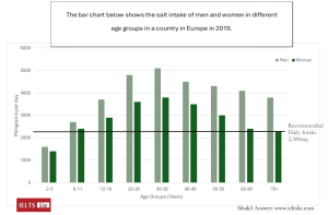
The bar chart illustrates the amount of salt an average man and woman consumed per day (divided into nine age groups) in a European country in 2019. Units are measured in milligrams.

(1)………………, men had a higher intake of salt compared to women and salt intake was above the recommended daily amount in most age groups. (2)………………….., middle aged men and women had the highest intake of salt, (3)………………….. young children who had the lowest. A greater difference in salt intake between the sexes could be seen as men and women aged.

The salt consumed by the youngest age group was just under 2000mg each day for boys but only 1500mg for girls aged five and below. Salt intake (4)…………… increased in both sexes to reach a high of over 5000mg in men and almost 4000mg in women aged 30 to 39.

(5)………………. the 40 to 49 age group, salt intake stood at about 4500mg daily for men, whereas for women it was around 3500mg. This decreased for both genders and by the age of 70 or more, consumption was still relatively high in men (just under 4000mg), (6)……………. women took the recommended daily amount of 2,300mg.

ANSWERS

Click below to reveal the answers to the exercise and the full complete model.

ANSWERS
  1. Overall
  2. Furthermore
  3. as opposed to
  4. then
  5. Regarding
  6. while
FULL MODEL & TIPS

The bar chart illustrates the amount of salt an average man and woman consumed per day (divided into nine age groups) in a European country in 2019. Units are measured in milligrams.

Overall, men had a higher intake of salt compared to women and salt intake was above the recommended daily amount in most age groups. Furthermore, middle aged men and women had the highest intake of salt, as opposed to young children who had the lowest. A greater difference in salt intake between the sexes could be seen as men and women aged.

The salt consumed by the youngest age group was just under 2000mg each day for boys but only 1500mg for girls aged five and below. Salt intake then increased in both sexes to reach a high of over 5000mg in men and almost 4000mg in women aged 30 to 39.

Regarding the 40 to 49 age group, salt intake stood at about 4500mg daily for men, whereas for women it was around 3500mg. This decreased for both genders and by the age of 70 or more, consumption was still relatively high in men (just under 4000mg), while women took the recommended daily amount of 2,300mg.

(200 words)

Tips & Comments

  1. The introduction is concise and introduces all key information about the chart, such as categories, divisions, units, country, frequency etc. Introductions are usually just one sentence in writing task 1 reports.
  2. The overview is separate and contains all key features about highs, lows and any useful comparisons that give a clear overview.
  3. The body paragraphs contain smaller detail and all sentences are supported by numbers from the chart.
  4. Rather than giving each individual age group, key points are selected and other groups are referred to as “salt intake increased over the age groups…”. This gives information about other age groups without going into too much detail.
  5. Always use flexible vocabulary about age: middle aged people/ children aged five and under / young children / as people grew older / the youngest age group / the oldest age group / over the age groups given / people aged 30 to 39 / the 40 to 49 age group / by the age of 70 or more / people between 30 and 39 years of age
  6. This chart does contain a lot of information which is why the report is 200 words in length. However, most reports will probably be between 170 and 190 words. Longer doesn’t mean better. It just depends on the chart. You do not need to write the word count under your report in your test – I do that just for your benefit.

.

FREE SUBSCRIBE

Subscribe to get new lessons & tips by email.

.

IELTS Bar Chart Model Answer for Change over Time

An IELTS bar chart and model answer which shows change over time. The IELTS bar chart below was reported in IELTS writing task 1 (Academic) and is likely to be repeated in following years. I’ve created a model answer lesson which has a useful language focus for you.

While this task 1 is in bar chart form, it actually shows change over time which means you will be also using language that is typically used for describing line graphs. It is different from the usual bar charts you see in IELTS which show comparisons of categories. This means it is more similar to a line graph than a normal bar chart. For this reason, I like to call such bar charts: bar charts of change over time. These types of bar charts do appear in IELTS writing task 1 quite regularly so look out for them.

IELTS Bar Chart Change over Time

Note that the chart depicted above was sent to me from an IELTS candidate.

Model Answer Bar Chart

Instructions: Fill in the model answer using the language options presented below:

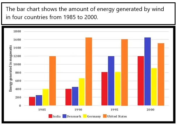
The bar chart illustrates how much energy was produced by wind in four countries (India, Denmark, Germany and the United States) in four years (1985, 1990, 1995 and 2000). Units are measured in megawatts.

Overall, the US produced the most wind energy over the period given except in the final year when Denmark produced the most. India, Denmark and Germany witnessed 1) ……….. over the years in the amount of energy they generated, whereas the US showed 2) ………. followed by a slight decline.

In terms of the US, energy production stood at 1200 megawatts in 1985. It peaked in 1990 at just over 1600 before 3) ……….. around 100 to 1500 in the final year.

On the other hand, the energy generated in Denmark was just over 200 megawatts in 1985 and then 4) …………. over the years 5) …………  just over 1600 in 2000. India also saw 6) …………. in energy generation, starting at 200 and ending at 1200. Lastly, Germany saw 7) ………….. , only doubling over the period to reach just over 800.

Fill in the gaps with the following words:

  • A.   a significant rise
  • B.   falling by
  • C.   to peak at
  • D.   a steady climb
  • E.   a much lower growth rate
  • F.   an initial increase
  • G.   rose almost eight-fold

ANSWERS

Click below to show the answers:

ANSWERS

Answers:

  1. D
    • This refers to all three countries (Denmark, India and Germany). Some countries had significant increases but not all. So, using the word “steady increase” is a better description to use for all three.
    • Having D in this gap will then allow the use of “a significant rise (A) for gap number 6 which relates to India only, which definitely was significant in energy growth.
  2. F
    • We can see that the only country with a growth rate that happened only in the first year was the US.
    • The answer can’t be G because an eight-fold rise means it grew from, for example, 100 to 800 (8 times in growth) – this isn’t true.
    • The answer can’t be D because the word “steady” refers to an even rise over a period of time as shown in the chart – the chart only shows a rise from one single column to the next, not over all columns.
    • It can’t be E because the growth rate wasn’t slower than other countries at the time.
  3. B
    • Nearly all of you got this right. Well done!
  4. G
    • Most of you got this one right too. Well done!
    • The answer can’t be A because it would be incorrect grammar. The sentence is “the energy generated was X number and then …..”. This gap requires a verb to follow the word “and”.
  5. C
    • Most of you got this right. Well done!
    • The final year for Denmark is significant because it is a special peak in the whole chart. Nearly all charts showing change over time will have one special peak that you should mention.
  6. A
    • This rise is significant. We can also say “considerable”. It rose from 200 to 1200 – that’s a huge rise.
    • Certain we could describe this as a steady rise (D) because it was consistent in growth over the period. But this doesn’t highlight how big the rise was which is the main point and also, we used option D already. So, the answer must be A.
  7. E
    • Most of you got this right. Well done !
    • This final paragraph is about Demark, India and Germany. From those three countries, Germany definitely showed the slowest growth rate over the period.

Don’t use this model answer only as a gap fill exercise. Notice the structure, organisation and content of paragraphs. Notice the grammar used. Notice the paraphrasing used.

 FULL MODEL ANSWER

The bar chart illustrates how much energy was produced by wind in four countries (India, Denmark, Germany and the United States) in four years (1985, 1990, 1995 and 2000). Units are measured in megawatts.

Overall, the US produced the most wind energy over the period given except in the final year when Denmark produced the most. India, Denmark and Germany witnessed a steady climb over the years in the amount of energy they generated, whereas the US showed an initial increase followed by a slight decline.

In terms of the US, energy production stood at 1200 megawatts in 1985. It peaked in 1990 at just over 1600 before falling by around 100 to 1500 in the final year.

On the other hand, the energy generated in Denmark was just over 200 megawatts in 1985 and then rose almost eight-fold over the years to peak at just over 1600 in 2000. India also saw a significant rise in energy generation, starting at 200 and ending at 1200. Lastly, Germany saw a much lower growth rate only doubling over the period to reach just over 800.

.

I hope you found this lesson useful, Liz 

……………………………………………………………….

FREE SUBSCRIBE

Subscribe to get new lessons & tips by email.

.

Capital Letters in IELTS: Will it affect your score?

When to use capital letters in your IELTS Listening, Reading and Writing test. Will you get a lower score if you make a mistake with capital letters? Can you write your answers in all capital letters? What are the rules for capital letters in IELTS? What about using capital letters in the computer based IELTS test? Read below to learn about this.

Using Capital Letters for IELTS Answers: Rules & Advice

Below you will find advice for using capital letters for writing your answers in IELTS Listening, Reading and Writing.

Capital Letters in IELTS Listening and Reading

In IELTS listening and reading, you can write all your answers in capital letters if you want. You can do this for the paper based test and the computer based test. It is completely up to you. There is no rule stating whether you should use capital or lower case.

  • You can write your answers in small letters if you want.
  • You can write in all capital letters.

Examples of capital letters in listening and reading:

  • HOSPITAL = correct / hospital = correct / 9am = correct / 9AM = correct 

Which is best? Capital letters or lower case?

I recommend writing your listening and reading answers in capital letters for the paper based test. This avoids any problems of markers struggling to read your handwriting. For the computer based test, it doesn’t matter. Both lower case and upper case will be easy to read. 

Transferring Answers in Listening & Reading

In IELTS listening, you will be given 10 mins extra to transfer your answers to your answer sheet in the paper based test. Check your answers and check your spelling – then write your answers on the answer sheet.  If your handwriting is poor, write using all capital letters so it is easy to read. For the computer based test, you do not need to transfer answers. You only need to check what you have already put into the computer. For this reason, you will be given only 2 mins to check your answers after the recording ends.

In IELTS reading, you will not get 10 extra mins to transfer your answers. You must write your answers directly on your answer sheet. But it is completely your choice how to write your answers. The most important factor is clear writing for the paper based test. Use all capital letters if your handwriting isn’t clear.

Capital Letters in IELTS Writing

In IELTS Writing, you can choose to write your essay in capital letters. But I would not recommend it because:

  1. you WILL be marked on punctuation so the use of capital letters and lower case is important to show. You must have a capital letter at the start of a sentence, for example.
  2. you have a strict time limit and it takes too long to write in capital letters

So, write your essay in lower case and remember to use capital letters when grammatically appropriate. The examiner will mark you down if you use capital letters incorrectly. Here is a list of typical words that use capital letters:

When to use capital letters in English grammar

  • Days/ Months = Thursday / September
  • Names and Titles = Mrs J Blogs / Dr Author Jones
  • Countries / Cities = India / Vietnam / Paris / Hong Kong
  • Names of Places = University of London
  • Acronyms = BBC (British Broadcasting Corporation)
  • Start of a Sentence = “The majority of people use cars to go to work these days. However, it would be better if they used healthier means of transport such as the bicycle.”

Biggest Mistake with Capital Letters

  • but / because / and
    • These linking words should NEVER be used to start a sentence in formal writing. See my page of linking words for writing task 2 to learn tips and get a useful list: IELTS Writing Task 2 Linking Words

What about speaking part 2? Well, the notes you make for your talk are not marked and only you see them. The examiner will not check them or mark them. So, don’t write sentences or bother with punctuation, just write words, ideas and tips to help you present a good talk.

More IELTS Tips

What about using a pen or pencil? Click on this link: IELTS Pen or Pencil

How are words counted in IELTS Listening? Click on this link: How Words are Counted in IELTS

Can I use “I” or “my” in writing task 2? Click on this link: How to express your opinion in IELTS WT2

Tips & Practice for Listening, Reading, Writing and Speaking:

……………..

Free Subscribe to get New Posts by Email

IELTS Line Graph Model (Band Score 9)

This model line graph for IELTS is estimated at band score 9. The model answer below is for IELTS writing task 1 academic paper. Use this sample writing as a template for structure, key features and language for any IELTS line graph. There are also some tips given below to guide you and help you understand how to describe this type of graph.

Line graphs will typically have between two or five lines. However, it is possible to have more than five lines. Depending on how many lines you have, you’ll need to decide how much data you present in your report. See the tips at the bottom of the page.

IELTS Line Graphs with Model Answers

IELTS Line Graph 1

This line graph is typical of IELTS writing task 1. It shows three lines and one of the lines doesn’t have any data for the first few years. See the model answer below to learn how to tackle this task.

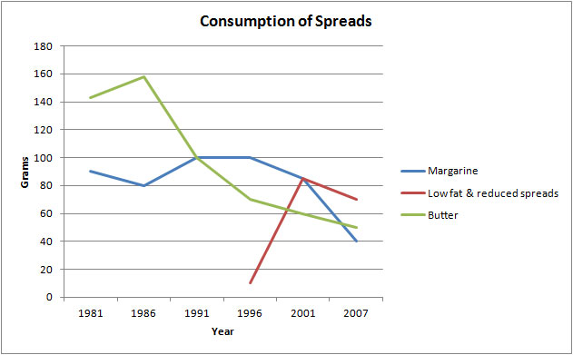
The graph below shows the consumption of three spreads from 1981 to 2007.

IELTS Line Graph

IELTS Line Graph Model Answer

The line graph illustrates the amount of three kinds of spreads (margarine, butter, and low fat and reduced spreads) which were consumed from 1981 to 2007. Units are measured in grams.

Overall, the consumption of margarine and butter decreased over the period given, while for low fat and reduced spreads, it rose.  At the start of the period, butter was the most popular spread. Margarine was the most widely consumed in the middle of the period but, by the end, low fat and reduced spreads was most popular.

With regards to the amount of butter used, it began at around 140 grams and then peaked at 160 grams in 1986 before falling dramatically to about 50 grams in the last year. Likewise, approximately 90 grams of margarine was eaten in the first year, after which the figure fluctuated slightly and dropped to a low of 40 grams in 2007.

On the other hand, the consumption of low fats and reduced spreads only started in 1996 at about 10 grams. This figure, which reached a high of just over 80 grams five years later, fell slightly in the final years to approximately 70 grams in 2007.

IELTS Line Graph 2: Five Lines

Essential tip for a line graph with many lines:

  • Don’t get lost in too much detail. Going beyond 200 words is very rare. Most tasks require only 170 and 190 words. Getting lost in detail and writing too much will give you a low score for Task Response, which counts for 25% of your marks. See this page: Band scores, Marking & Tips for bands 5 to 8.

IELTS Line Graph Model Answer

Line Graph Model Answer

The line graph illustrates how many weekly hospital admissions there were in Fortsmith, Adlin, Stanton, Bardley and Oxley, which are hospitals located in a European country, between 2004 and 2018.

Overall, for most of the period given Bardley had the most admissions, while Stanton had the least. Oxley was the only hospital to see a decline in admissions and Fortsmith was unique in that their admission figures remained relatively stable over the period. Admissions to all other hospitals increased during the years given.

Admissions to Oxley hospital started at just under 250 a week in 2004 but more than halved by the final year (just over 100 admissions). Fortsmith weekly hospital admissions fluctuated at around 200 for the whole period.

On the other hand, the number of people admitted to Adlin hospital rose dramatically from just over 100 in the first year to 250 by 2018. Likewise, Bardley also saw a rise from 200 to peak at over 250, the highest for any hospital. In terms of Stanton hospital, only approximately 70  people were admitted in 2008 and this gradually climbed to slightly over 150 in 2018.

Words = 187

Below are key steps for tackling an IELTS line graph:

  1. Paraphrase the line graph information for your introduction.
  2. Add axis information to your introduction if needed, such as categories or units.
  3. Put main trends and any other key features in an overall statement. The overview is the most important statement in your writing task 1. One sentence for an overview usually isn’t enough.
  4. Organise body paragraphs logically because you are being marked on this. Make sure to always have two body paragraphs (three occasionally). Decide which lines show trends that should be grouped together.
  5. Make sure each sentence in the body paragraphs has numbers and dates to support it. This is vital for Task Response.
  6. Ensure all data is accurate. If you are not sure the number is precise, write “about” or “approximately”.
  7. Use a range of linking words. Try not to repeat them.
  8. Aim for around 180 words for writing task 1. Try not to write over 200 words. More does not mean better.
  9. Line graphs have specific vocabulary that you must showcase. Learn nouns, adjectives, verbs and adverbs carefully: Line Graph Vocabulary

RECOMMENDED FOR YOU – IELTS WRITING TASK 1

Click below:

FREE SUBSCRIBE

Subscribe to get new lessons & tips by email.

.

IELTS Writing Answer Sheet: Video Tutorial

Practise using the official IELTS writing answer sheet before your test. Learn how the examiner uses the paper to record your band score and what extra information is contained on it. This lesson also explains how to fill in the answer sheet and how to use it effectively to estimated your word count. People taking the computer based IELTS test will see the word count on their screens.

Below is a link to download the answer sheet so you can practise writing on it before your test. Any student taking the IELTS test for the first time, should watch this lesson.

Click link to download: official ielts-writing-answersheet

If you are taking the computer based test, remember that the word count is given for you on the screen. This is really useful.

Recommended Lessons

Writing Task 2 Video Lesson: How to write an introduction

MORE FREE IELTS WRITING TASK 2 LESSONS:

IELTS Table & Pie Charts Model Answer

The IELTS table and pie chart below have been reported twice in the IELTS writing task 1 test and this task is likely to appear again.. The topic is the imports of fish to the US from various countries and the value of these imports.

Note: The writing task 1 below is a reproduction of the original IELTS task 1 by an IELTS candidate. This means details will vary from the original. Even so, it gives a great chance to practise multiple tasks.

IELTS Writing Task 1: Table & Pie Charts 

IELTS writing task 1 (academic) test. This task is slightly different to the one featured in my video (Introduction Paragraph in Writing Task 1). Note that is it about value and not cost.

Model Answer: IELTS Table & 3 Pie Charts

Instructions: The following model answer has been divided into sentences (A-H). Put them in the correct order to find a band score 9 model writing task 1 report.

A) In terms of the source of fish importation, Canada supplied the overwhelming majority in 1988 (60%) compared to China and other countries which provided only 13% and 27% respectively.

B) Regarding the table, the value of imports started at $6.57 billion in the first year, increasing to $8.52 in 1992 and reaching $10.72 in the last year.

C) Overall, the value of imports rose by just under double over the period given.

D) Likewise, imports from China rose over the period to reach 30% in 2000.

E) At the start of the period, the US imported fish predominantly from Canada but, by the final year, other countries had become the main source.

F) Conversely, by 1992, other countries had replaced Canada as the main supplier and made up 46% of all imports in 1992 and 42% by 2000.

G) The table shows the value of fish that was imported to the US (measured in billions of dollars) in 1988, 1992 and 2000, while the three pie charts illustrate the proportion of fish that the US brought in from China, Canada and other countries in the same three years.

H) The imports from Canada then proceeded to fall to 28% in the final year.

ANSWERS & FULL MODEL ANSWER:

Click here to reveal answers and model: Answers

Answer: G C E B A H F D

See the model answer below to check how the above information is organised into paragraphs.

IELTS Model Answer: Table & 3 Pie Charts

The table shows the value of fish (in billions of dollars) that was imported to the US in 1988, 1992 and 2000, while the three pie charts illustrate the proportion of fish that the US brought in from China, Canada and other countries in the same three years.

Overall, the value of imports rose by just under double over the period given. At the start of the period, the US imported fish predominantly from Canada but, by 1992 other countries became the main source.

Regarding the table, the value of imports started at $6.57 billion in the first year, increasing to $8.52 in 1992 and reaching $10.72 in the last year.

In terms of the source of fish importation, Canada supplied the overwhelming majority in 1988 (60%) compared to China and other countries which provided only 13% and 27% respectively. The imports from Canada then proceeded to fall to 28% in the final year. Conversely, by 1992, other countries had replaced Canada as the main supplier and made up 46% of all imports in 1992 and 42% by 2000. Likewise, imports from China rose over the period to reach 30% in 2000.

Examiner Comment: Vocabulary is accurate and flexible. Paraphrase for the topic vocabulary =fish importation, provided, supplied, suppliers. Please note that the topic vocabulary provided by IELTS was also used and this is fine. Sentences are complex and accurate. The writer offers a good range of sentence structures and linking words (while, overall, regarding, in terms of, compared to, likewise, on the other hand). The overview statement is easy to find and contains the key features for both table and charts. Details are well organised into logical body paragraphs. It is fine that body paragraphs are not of equal length in report writing. This is estimated at band 9.

.

More IELTS Writing Task 1:

For more multiple tasks and other types of task 1 model answers, click below:

Note: GT candidates are not given such tasks. GT writing task 1 is a letter only. Click here: Essential Tips for IELTS GT Letter

FREE SUBSCRIBE

Subscribe to get new lessons & tips by email.

.

error: Content is protected !!