IELTS Table & Pie Charts Model Answer

The IELTS table and pie chart below have been reported twice in the IELTS writing task 1 test and this task is likely to appear again.. The topic is the imports of fish to the US from various countries and the value of these imports.

Note: The writing task 1 below is a reproduction of the original IELTS task 1 by an IELTS candidate. This means details will vary from the original. Even so, it gives a great chance to practise multiple tasks.

IELTS Writing Task 1: Table & Pie Charts 

IELTS writing task 1 (academic) test. This task is slightly different to the one featured in my video (Introduction Paragraph in Writing Task 1). Note that is it about value and not cost.

Model Answer: IELTS Table & 3 Pie Charts

Instructions: The following model answer has been divided into sentences (A-H). Put them in the correct order to find a band score 9 model writing task 1 report.

A) In terms of the source of fish importation, Canada supplied the overwhelming majority in 1988 (60%) compared to China and other countries which provided only 13% and 27% respectively.

B) Regarding the table, the value of imports started at $6.57 billion in the first year, increasing to $8.52 in 1992 and reaching $10.72 in the last year.

C) Overall, the value of imports rose by just under double over the period given.

D) Likewise, imports from China rose over the period to reach 30% in 2000.

E) At the start of the period, the US imported fish predominantly from Canada but, by the final year, other countries had become the main source.

F) Conversely, by 1992, other countries had replaced Canada as the main supplier and made up 46% of all imports in 1992 and 42% by 2000.

G) The table shows the value of fish that was imported to the US (measured in billions of dollars) in 1988, 1992 and 2000, while the three pie charts illustrate the proportion of fish that the US brought in from China, Canada and other countries in the same three years.

H) The imports from Canada then proceeded to fall to 28% in the final year.

ANSWERS & FULL MODEL ANSWER:

Click here to reveal answers and model: Answers

Answer: G C E B A H F D

See the model answer below to check how the above information is organised into paragraphs.

IELTS Model Answer: Table & 3 Pie Charts

The table shows the value of fish (in billions of dollars) that was imported to the US in 1988, 1992 and 2000, while the three pie charts illustrate the proportion of fish that the US brought in from China, Canada and other countries in the same three years.

Overall, the value of imports rose by just under double over the period given. At the start of the period, the US imported fish predominantly from Canada but, by 1992 other countries became the main source.

Regarding the table, the value of imports started at $6.57 billion in the first year, increasing to $8.52 in 1992 and reaching $10.72 in the last year.

In terms of the source of fish importation, Canada supplied the overwhelming majority in 1988 (60%) compared to China and other countries which provided only 13% and 27% respectively. The imports from Canada then proceeded to fall to 28% in the final year. Conversely, by 1992, other countries had replaced Canada as the main supplier and made up 46% of all imports in 1992 and 42% by 2000. Likewise, imports from China rose over the period to reach 30% in 2000.

Examiner Comment: Vocabulary is accurate and flexible. Paraphrase for the topic vocabulary =fish importation, provided, supplied, suppliers. Please note that the topic vocabulary provided by IELTS was also used and this is fine. Sentences are complex and accurate. The writer offers a good range of sentence structures and linking words (while, overall, regarding, in terms of, compared to, likewise, on the other hand). The overview statement is easy to find and contains the key features for both table and charts. Details are well organised into logical body paragraphs. It is fine that body paragraphs are not of equal length in report writing. This is estimated at band 9.

.

More IELTS Writing Task 1:

For more multiple tasks and other types of task 1 model answers, click below:

Note: GT candidates are not given such tasks. GT writing task 1 is a letter only. Click here: Essential Tips for IELTS GT Letter

FREE SUBSCRIBE

Subscribe to get new lessons & tips by email.

.

IELTS Writing Task 1: Pie Chart Model Score 9

How to compare two pie charts in IELTS writing task 1. This sample answer illustrates the method of organising the report as well as useful language and sentence structures to get a band score 9.

IELTS Pie Charts

The pie charts below show the comparison of different kinds of energy production of France in two years.

ielts pie chart comparison

Source: Above pie charts not created by IELTS Liz.

Pie Chart Sample Answer

The two pie charts illustrate the proportion of five sources of energy production (coal, gas, nuclear, petrol and other sources) in France in two years (1995 and 2005). 

Overall, in both years coal and gas accounted for over half of all energy production, while the least was other energy sources. There was only a very minimal increase in production from gas and coal, whereas nuclear and other sources almost doubled. Petrol was the only energy source to decrease over the period.

Energy produced by coal comprised of 29.80% in 1995 and by 2005, it increased by about 1% to 30.9%. Likewise, the amount of energy generated by gas went up by approximately 1% from 29.63% in the first year to 30.1% by the final year. The use of nuclear power rose significantly from 6.40% in 1995 to 10.10% in 2005. Other sources of energy production accounted for 4.90% but then climbed to 9.10%.

Petrol, on the other hand, produced 29.27% of all energy in 1995 but 10 years later only 19.55% of energy came from this source. 

Words = 177

IELTS Pie Chart Tips

  • Introduction paragraph should introduce all aspects of the task.
  • The overview must contain all key features of all pie charts. This is the most important paragraph and should not be only one sentence. You must identify the key features of both charts and present them as an overview. You are being marked on the content of this paragraph.
  • Always highlight the largest and smallest proportions in the overview. 
  • Note whether the pie charts show change over time or comparison of categories divided by gender or in a similar way. Not all pie charts are the same. Depending on the information given, you’ll use different language and organise things differently.
  • If there are two pie charts in different time periods, then you must highlight the key changes / trends.
  • Use pie chart language – accounts for / comprises of / represents.
  • The phrase “Units are measured in …” should be used when the units have not been stated in the previous sentence.

RECOMMENDED FOR YOU

Click below:

FREE SUBSCRIBE

Subscribe to get new lessons & tips by email.

.

IELTS Writing Task 1 – Step by Step Guide (Pie Charts)

This lesson takes you step by step through an IELTS Writing Task 1 sample answer. Learn in easy steps how to describe IELTS Pie Charts for writing task 1. Below are easy techniques to help you write each paragraph: introduction, overview, body paragraph 1 and body paragraph 2.

How to Tackle IELTS Writing Task 1

This lesson focuses on two pie charts. As you see, below, pie charts can have a lot of categories. Most people think the best way is to organise information by describing one pie chart at a time. However, this is not usually the most effective way to tackle them if you are aiming for band score 7 and above.

IELTS Pie Charts – Example Task

IELTS pie chart lesson

Source: The above pie charts were not created by IELTS Liz.

Describing Pie Charts Step by Step

Below you will find easy to follow advice on how to describe your IELTS pie chart paragraph by paragraph.

Introduction

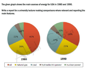
You must paraphrase the information given at the top of the charts “The graph shows the main sources of energy for the USA in 1980 and 1990”. You cannot copy this, you must use your own language and then add any extra information needed from the charts.

Tips

  • the graph = the pie chart
  • shows = illustrates
  • main sources of energy = energy production from different sources
  • for the USA = don’t change this
  • in 1980 and 1990 = in two different years (1980 and 1990)

Try writing your introduction before checking the model answer. To see model introduction, click here: Model Answer

The pie charts illustrate the changes in energy production from five different sources (oil, natural gas, coal, hydroelectric power and nuclear power) for the USA in two years (1980 and 1990).

Overview

The overview contains the key features of the charts. Answer the questions below to find the key features.

  1. What was the main source of energy in 1980?
  2. What was the main source of energy in 1990?
  3. Which produced the least energy in 1980?
  4. Which produced the least energy in 1990?
  5. Did the amount of energy produced by each source change a lot or just a little between the years?
  6. Did all types of energy increase by 1990?

Now write your overview before you check the model. To see model overview, click here: Model Answer

Overall, oil  constituted the main source of energy production in both years, while hydroelectric power  produced the least energy. There was a slight decrease in production from oil and natural gas, whereas an increase can be seen in the figures for coal and nuclear power.

Body Paragraph 1

This paragraph will give details about oil and hydroelectric power, which we highlighted in the overview above.

Tips

  • You will need to write one sentence about oil comparing the percentage each year and then one sentence about hydroelectric power comparing the years.
  • You must add data (percentages and dates) to support each sentence

Here are two example sentences. Fill in the gaps with the right words.

The amount of energy produced by oil in the USA 1. ………………. 42% in 1980 and this, then, 2. ………………….. to a third (33%) in 1990. The proportion of energy from hydroelectric power, 3………………, remained constant in both years ………a mere 5%.

For answers, click here: Answers

  1. accounted for / comprised of / made up / was
  2. fell / declined / dropped / went down / decreased
  3. on the other hand / by contrast / in contrast ( we use a linker to highlight that this is opposing information to the previous sentence)
  4. at

Body Paragraph 2

This paragraph will give detail about the other sources of energy in the pie charts.

Tips

  • which sources increased?
  • which sources decreased?
  • what were the percentages for each source?

Again, fill in the gaps in these model sentences.

The energy generated by natural gas, which was the second 1. …………… source of energy in the USA in 1980, fell 2. ………. 1% to a quarter of all energy produced in 1990. In contrast, production by coal 3. ……………… from 22% to 27% in 1990 4. …………….. there was a 5% rise in energy from nuclear power to reach 10% in the second year.

For answers, click here: Answers

  1.  largest / major
  2. by (this is used when writing about differences in amounts)
  3. increased / rose / went up / climbed / grew
  4. while / whereas

Recommended Lessons

FREE SUBSCRIBE

Subscribe to get new lessons & tips by email.

.

Answer for IELTS Writing Task 1 2016

The IELTS model answer below is for a recent IELTS writing task 1 which was reported in early 2016. The two pie charts and bar chart are illustrated beneath the report. Further down the page, you will also find examiner comments and a download link for this model answer and task. Also note the useful links provided for more IELTS writing task 1 lessons. This is for the IELTS writing task 1 academic test.

IELTS Model Answer, Reported 2016

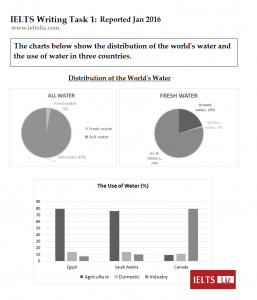
The pie charts give information about how the world’s water is distributed, whereas the bar chart illustrates the percentage of water used in agriculture, domestic use and industry in three countries (Egypt, Saudi Arabia and Canada).

Overall, salt water makes up an overwhelming majority of the world’s water. Fresh water is made up of mainly water from ice and glaciers. While most water in Egypt and Saudi Arabia is used for agriculture, in Canada it is predominantly used for industry.

The pie charts show that 97% of global water is salt water compared to a mere 3% which is fresh water. Water from ice and glaciers accounts for 79% of all fresh water as opposed to ground water and surface water (20% and 1% respectively).

In terms of the use of water, both Egypt and Saudi Arabia use almost 80% of their water for agriculture in comparison to domestic usage and industry which account for approximately 15% and 10% respectively. The reverse is seen in Canada where only 10% of water is used for agriculture and domestic purposes in contrast to industry, which uses 80% of water in Canada.

Words = 189

IELTS Writing Task 1 Charts Jan 2016

Download this writing task 1 with model answer: IELTS Writing Task 1 Charts & Model 2016

Examiner Comments:

The information is well organised into logical paragraphs. The overview paragraph contains the key features of all charts. Information is accurate and no irrelevant information is given. There is a flexible range of linking devices for showing comparisons. Vocabulary is well used and this report contains complex sentence structures.

Recommended

Get my free lessons by email

Subscribe for free to get my new IELTS lessons sent to your email inbox.

Reported IELTS Writing Task 1 Charts for January 2016

The IELTS writing task 1 charts were reported on January 9th by two students (Kirush and Adam). This shows two pie charts and a bar chart illustrating world water distribution and usage. Follow the link for a model answer to the 2016 IELTS writing task 1 below.

Reported IELTS Writing Task 1 Jan 2016

Download the PDF file for the charts below: Recent IELTS Writing task 1 2016

IELTS Writing Task 1 Charts Jan 2016

Model Answer for above charts

Other Pages for IELTS:

Click to view page:

Main IELTS Pages

Develop your IELTS skills with tips, lessons, free videos and more.

Get my free lessons by email

Subscribe for free to get my new IELTS lessons sent to your email inbox.

Pie Chart and Bar Chart for IELTS Writing Task 1

It is possible to be given two charts together in IELTS writing task 1. Below you will see two pie charts followed by a bar chart. This exercise will focus on how to structure your report and how to highlight the key features of both charts in one overview.

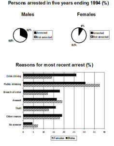
The charts below show the males and females arrested over 5 years and the reasons for the most recent arrests.

two IELTS charts

Source: The above charts were not created by IELTS Liz.

Two Charts: Structure and Overview

Answer the questions below in order to decide your paragraphing for your task 1 report.

  1. Will you put the introduction separately?
  2. Will you have an overview or conclusion?
  3. How many body paragraphs will you have?
  4. What order will you put your paragraphs in?
  5. Will your body paragraphs be equal lengths?

Answers

  1. Yes, the introduction should go in a separate paragraph.
  2. You must have an overview not a conclusion. The overview can go after the introduction.
  3. You should have 4 paragraphs in total.
  4. You should have an introduction, an overview, one body paragraph for the pie chart detail and one body paragraph for the bar chart detail.
  5. The body paragraph with pie chart detail will be shorter than the body paragraph with details about the bar chart


Now write your overview. this paragraph must contain key features from both charts. This means you must write one sentence about the key features of the pie charts and one sentence for the key features of the other chart. After you have written your overview, check the sample overview. Model Overview

Overall, over the five year period finishing in 1994, there were significantly more males arrested than females. The majority of arrests were due to public drinking while no answer was given for the least number of arrests for both genders.


Recommended

Get my free lessons by email

Subscribe for free to get my new IELTS lessons sent to your email inbox.

error: Content is protected !!