An IELTS bar chart and model answer which shows change over time. The IELTS bar chart below was reported in IELTS writing task 1 (Academic) and is likely to be repeated in following years. I’ve created a model answer lesson which has a useful language focus for you.
While this task 1 is in bar chart form, it actually shows change over time which means you will be also using language that is typically used for describing line graphs. It is different from the usual bar charts you see in IELTS which show comparisons of categories. This means it is more similar to a line graph than a normal bar chart. For this reason, I like to call such bar charts: bar charts of change over time. These types of bar charts do appear in IELTS writing task 1 quite regularly so look out for them.
IELTS Bar Chart Change over Time
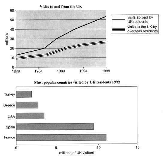
Note that the chart depicted above was sent to me from an IELTS candidate.
Model Answer Bar Chart
Instructions: Fill in the model answer using the language options presented below:
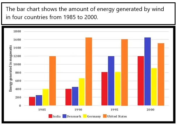
The bar chart illustrates how much energy was produced by wind in four countries (India, Denmark, Germany and the United States) in four years (1985, 1990, 1995 and 2000). Units are measured in megawatts.
Overall, the US produced the most wind energy over the period given except in the final year when Denmark produced the most. India, Denmark and Germany witnessed 1) ……….. over the years in the amount of energy they generated, whereas the US showed 2) ………. followed by a slight decline.
In terms of the US, energy production stood at 1200 megawatts in 1985. It peaked in 1990 at just over 1600 before 3) ……….. around 100 to 1500 in the final year.
On the other hand, the energy generated in Denmark was just over 200 megawatts in 1985 and then 4) …………. over the years 5) ………… just over 1600 in 2000. India also saw 6) …………. in energy generation, starting at 200 and ending at 1200. Lastly, Germany saw 7) ………….. , only doubling over the period to reach just over 800.
Fill in the gaps with the following words:
- A. a significant rise
- B. falling by
- C. to peak at
- D. a steady climb
- E. a much lower growth rate
- F. an initial increase
- G. rose almost eight-fold
ANSWERS
Click below to show the answers:
ANSWERSAnswers:
- D
- This refers to all three countries (Denmark, India and Germany). Some countries had significant increases but not all. So, using the word “steady increase” is a better description to use for all three.
- Having D in this gap will then allow the use of “a significant rise (A) for gap number 6 which relates to India only, which definitely was significant in energy growth.
- F
- We can see that the only country with a growth rate that happened only in the first year was the US.
- The answer can’t be G because an eight-fold rise means it grew from, for example, 100 to 800 (8 times in growth) – this isn’t true.
- The answer can’t be D because the word “steady” refers to an even rise over a period of time as shown in the chart – the chart only shows a rise from one single column to the next, not over all columns.
- It can’t be E because the growth rate wasn’t slower than other countries at the time.
- B
- Nearly all of you got this right. Well done!
- G
- Most of you got this one right too. Well done!
- The answer can’t be A because it would be incorrect grammar. The sentence is “the energy generated was X number and then …..”. This gap requires a verb to follow the word “and”.
- C
- Most of you got this right. Well done!
- The final year for Denmark is significant because it is a special peak in the whole chart. Nearly all charts showing change over time will have one special peak that you should mention.
- A
- This rise is significant. We can also say “considerable”. It rose from 200 to 1200 – that’s a huge rise.
- Certain we could describe this as a steady rise (D) because it was consistent in growth over the period. But this doesn’t highlight how big the rise was which is the main point and also, we used option D already. So, the answer must be A.
- E
- Most of you got this right. Well done !
- This final paragraph is about Demark, India and Germany. From those three countries, Germany definitely showed the slowest growth rate over the period.
Don’t use this model answer only as a gap fill exercise. Notice the structure, organisation and content of paragraphs. Notice the grammar used. Notice the paraphrasing used.
The bar chart illustrates how much energy was produced by wind in four countries (India, Denmark, Germany and the United States) in four years (1985, 1990, 1995 and 2000). Units are measured in megawatts.
Overall, the US produced the most wind energy over the period given except in the final year when Denmark produced the most. India, Denmark and Germany witnessed a steady climb over the years in the amount of energy they generated, whereas the US showed an initial increase followed by a slight decline.
In terms of the US, energy production stood at 1200 megawatts in 1985. It peaked in 1990 at just over 1600 before falling by around 100 to 1500 in the final year.
On the other hand, the energy generated in Denmark was just over 200 megawatts in 1985 and then rose almost eight-fold over the years to peak at just over 1600 in 2000. India also saw a significant rise in energy generation, starting at 200 and ending at 1200. Lastly, Germany saw a much lower growth rate only doubling over the period to reach just over 800.
.
I hope you found this lesson useful, Liz
……………………………………………………………….
.