Pie Chart and Bar Chart for IELTS Writing Task 1

It is possible to be given two charts together in IELTS writing task 1. Below you will see two pie charts followed by a bar chart. This exercise will focus on how to structure your report and how to highlight the key features of both charts in one overview.

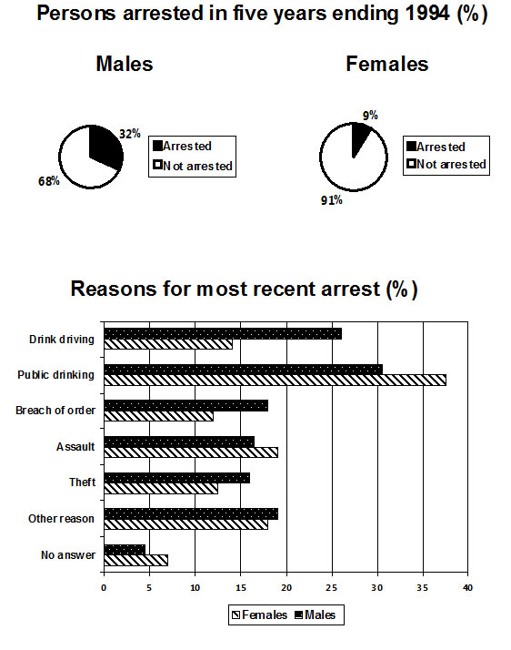
The charts below show the males and females arrested over 5 years and the reasons for the most recent arrests.

two IELTS charts

Source: The above charts were not created by IELTS Liz.

Two Charts: Structure and Overview

Answer the questions below in order to decide your paragraphing for your task 1 report.

  1. Will you put the introduction separately?
  2. Will you have an overview or conclusion?
  3. How many body paragraphs will you have?
  4. What order will you put your paragraphs in?
  5. Will your body paragraphs be equal lengths?
Answers
  1. Yes, the introduction should go in a separate paragraph.
  2. You must have an overview not a conclusion. The overview can go after the introduction.
  3. You should have 4 paragraphs in total.
  4. You should have an introduction, an overview, one body paragraph for the pie chart detail and one body paragraph for the bar chart detail.
  5. The body paragraph with pie chart detail will be shorter than the body paragraph with details about the bar chart


Now write your overview. this paragraph must contain key features from both charts. This means you must write one sentence about the key features of the pie charts and one sentence for the key features of the other chart. After you have written your overview, check the sample overview. Model Overview

Overall, over the five year period finishing in 1994, there were significantly more males arrested than females. The majority of arrests were due to public drinking while no answer was given for the least number of arrests for both genders.


Recommended

Get my free lessons by email

Subscribe for free to get my new IELTS lessons sent to your email inbox.

Vocabulary for Accurate Data in Writing Task 1

Using the right vocabulary to present data in IELTS writing task 1 is essential if you are aiming for a high score. The video tutorial below explains why it is important to give accurate data when describing a chart in and provides a range of flexible vocabulary to help you achieve a better score.

Writing Task 1 Vocabulary for Data

Make sure you describe data accurately using a range of vocabulary. Lack of accuracy will lower your score for IELTS writing task 1. This video will help you understand more about this.

Summary

It’s very important that all the information you give is accurate the examiner will check and any mistakes will lower your band score.

Looking at the video, you will see this sentence is possible: In the age group 20 to 30, 28% of men smoked compared to 30% of women.  What is the problem? Can you see any mistake? The problem  is that the data for women is correct 30% but for men we can see it is under 30. We cannot see that it is 28%, but we can write it is about 30% or just under 30% or slightly less than 30%. We need to do is we need to use flexible language to give the accurate information let’s have a look.

Below I have listed useful language to help you present data more accurately and flexibly to avoid repeated words.

Under

  • under
  • below
  • less than
  • just under
  • slightly under
  • nearly
  • almost
  • close to
  • well under
  •  considerably less than

About

  • about
  • approximately
  • around

Over

  • over
  • above
  • more than
  • just over
  • slightly over
  • marginally above
  • well over
  • considerably more than

Recommended

Get my free lessons by email

Subscribe for free to get my new IELTS lessons sent to your email inbox.

A High Score Bar Chart Exercise

Fill in the gaps to complete the high score bar chart for  IELTS writing task 1. Use the completed bar chart report to model your own writing as it gives the right structure to use and a good range of sentence structures and language.

Below are useful sentence structures which are commonly used for bar charts for each paragraph (the introduction, overview and body paragraphs) to make up a complete task 1 writing model.

You will see a full report for the bar chart below and you must fill in the gaps to complete it by using the correct verb in their appropriate form.

The bar chart below shows the number of research students studying different subject in 2005.

IELTS bar chart

Source: The above chart was not created by IELTS Liz.

Model IELTS Bar Chart Report

Fill in the report below using the following verbs. You must put the verbs in the correct form and tense. Each verb can be used more than once.

to be   /   to see  / to study   /  to  illustrate  /  to show  /  to choose  / to learn  /  to prefer

The bar chart (1).  ………………… how many male and female research students (2). ……………….. six different subjects (linguistics, psychology, natural sciences, engineering, programming and mathematics) in 2005.

Overall, there (3). …………. more male research students than females in 2005. Although the most popular subject for both genders 4. …………..natural sciences, men least (5). …………….. linguistics and women (6). …………. little interest in mathematics. Linguistics was the only subject that 7. ………… favoured by women more than men.

There was a similar number of men and women in three subjects. There were equal numbers in research students (200) (8). ……………….. natural sciences. There was a difference between the genders of about 25 in both psychology and linguistic with more women (9). …………….. linguistics (around 110) and more men taking psychology (200).

A difference of about half (10)………… evident in engineering and programming where 150 men chose both subjects. By contrast, 200 men selected mathematics which was approximately five fold that of women (about 40).

Answers
  1. illustrates
  2. studied
  3. were
  4. was
  5. preferred
  6. showed
  7. was
  8. studying / learning
  9. studying / learning / choosing
  10. was

Recommended

Get my free lessons by email

Subscribe for free to get my new IELTS lessons sent to your email inbox.

Introduction and Overview for an IELTS Bar Chart

An introduction and overview for an IELTS chart is given below. The introduction is the easiest paragraph to write and the overview is the most important paragraph in your report. Look at the sample paragraphs below for the IELTS chart given and fill in the gaps. This lesson will help you understand introduction and overview content as well as improve your language skills.

The chart below shows the average monthly expenditure by British households in three years.

ielts chart

Introduction and Overview for an IELTS Chart

Fill in the gaps with no more than two words in order to complete the introduction and overview for the above chart. Remember this is about paraphrasing and ensuring information is stated correctly.

Introduction

The (1) ……………………… illustrates the typical (2)  ……………………….. of money spent each month on utility bills, transport, rent, entertainment (3) …………..groceries by households in Britain in three years (1990, 2000 and 2010). Units are (4) …………………. in pounds sterling.

Overview

(5) …………………., the largest expenditure by far was on rent in all three years, (6)  ………………. the least amount of money spent was on utility bills and entertainment. Although there was a significant (7)  …………………. in spending on rent, transport and utility bills, there was little change in the amount spent on the two other items.

Answers & Full Model
  1. chart / bar chart
  2. amount
  3. and
  4. measured
  5. Overall (this is the most appropriate linker to use)
  6. whereas / while
    1. it is not possible to use “in comparison to” or any similar linker due to the grammar structure of the sentence. To use “in comparison to” the sentence must read “…the largest expenditure was on rent in comparison to the least amount of money spent which was on …”
  7. increase / rise / growth

Here is a full model answer with an alternative introduction:

The bar chart illustrates how much money households in Britain spent in an average month on utility bills, transport, rent, entertainment and groceries in 1990, 2000 and 2010. Units are measured in pounds sterling.

Overall, the largest expenditure by far was on rent, whereas the least amount of money spent was on utility bills and entertainment. Although there was a significant rise in spending on rent, transport and utility bills, there was little change in the amount spent on the two other items.

Expenditure on rent increased from around £450 per month in 1990 to £600 by 2010. Likewise, money spent on transport and utility bills climbed by almost £100 to about £250 and £150 respectively.

On the other hand, the typical amount of money spent on groceries in the UK barely changed, remaining at just over £300 over the three year period. The money spent on entertainment showed marginal change dropping only by approximately £10 to £100 in the final year.

Tips & Vocab
Paraphrases:

  • shows = illustrates
  • the average monthly = in a typical month
  • expenditure = amount of money spent / how much money was spent

As you can see paraphrases are minimal. Instead of lots of unnecessary paraphrases, alter the structure of the sentence to showcase your language skills. Over paraphrasing can lead to unnecessary errors which can lower your score.

Tips:

  • Either state how many categories there are or list each category in the introduction.
  • Always give dates in the introduction.
  • Give the units if necessary as a final sentence in the introduction.
  • Put key features together in the overview.
  • The overview is usually a separate paragraph which starts with the linking word “Overall”. This helps the examiner locate the overview quickly which is considered a good aspect of report writing.
  • This IELTS chart is considered a simple chart and all students aiming for band score 6 and above should be able to write this report without many errors.
  • See the recommended links below to help you further.

.

Recommended Lessons

Click below to open the link:

…………………………………..

Free Subscribe to get New Posts by Email

IELTS Writing Task 1: Bar Chart

A free video lesson on an IELTS writing task 1 bar chart.

Describing a Bar Chart Step by Step

[su_youtube url=”https://youtu.be/E3U1Y1jgGls”]

Recommended:

Get my free lessons by email

Subscribe for free to get my new IELTS lessons sent to your email inbox.

IELTS Bar Chart Sample Answer

Below is a band score 9 sample answer for an IELTS  bar chart in writing task 1. Below the model is a link to a video lesson about how to describe an IELTS bar chart. Watch the video to learn essential tips for each paragraph for a high score bar chart.

IELTS bar chart

The bar chart illustrates how many children, divided by gender, played six kinds of sports (tennis, badminton, cycling, swimming, football and hockey) in a town in England in 2012.

Overall, the number of  boys playing sport exceeded that of girls in the given period and the sport with the most significant difference between the genders was football. Football was also the most popular sport for boys while the majority of girls preferred swimming. Furthermore, both males and females least preferred playing hockey.

There were four sports in which boys participated more than girls. While 60 boys played football, the number of girls playing that sport was considerably lower (around 20).  With regards to tennis, the figure for boys who played that sport was 50 as opposed to just under 40 for girls. Similarly, more boys cycled than girls (approximately 35and 20 respectively). The difference, in terms of hockey, was minimal with only about 5 more boys playing that sport than girls.

On the other hand, more girls took part in the two remaining sports which both showed a difference of about 10 between the genders. As many as 50 girls preferred swimming in comparison to 40 girls for badminton.

Recommended Lessons

error: Content is protected !!