IELTS Bar Chart Model Answer for Change over Time

An IELTS bar chart and model answer which shows change over time. The IELTS bar chart below was reported in IELTS writing task 1 (Academic) and is likely to be repeated in following years. I’ve created a model answer lesson which has a useful language focus for you.

While this task 1 is in bar chart form, it actually shows change over time which means you will be also using language that is typically used for describing line graphs. It is different from the usual bar charts you see in IELTS which show comparisons of categories. This means it is more similar to a line graph than a normal bar chart. For this reason, I like to call such bar charts: bar charts of change over time. These types of bar charts do appear in IELTS writing task 1 quite regularly so look out for them.

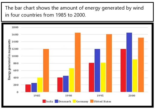
IELTS Bar Chart Change over Time

Note that the chart depicted above was sent to me from an IELTS candidate.

Model Answer Bar Chart

Instructions: Fill in the model answer using the language options presented below:

The bar chart illustrates how much energy was produced by wind in four countries (India, Denmark, Germany and the United States) in four years (1985, 1990, 1995 and 2000). Units are measured in megawatts.

Overall, the US produced the most wind energy over the period given except in the final year when Denmark produced the most. India, Denmark and Germany witnessed 1) ……….. over the years in the amount of energy they generated, whereas the US showed 2) ………. followed by a slight decline.

In terms of the US, energy production stood at 1200 megawatts in 1985. It peaked in 1990 at just over 1600 before 3) ……….. around 100 to 1500 in the final year.

On the other hand, the energy generated in Denmark was just over 200 megawatts in 1985 and then 4) …………. over the years 5) …………  just over 1600 in 2000. India also saw 6) …………. in energy generation, starting at 200 and ending at 1200. Lastly, Germany saw 7) ………….. , only doubling over the period to reach just over 800.

Fill in the gaps with the following words:

  • A.   a significant rise
  • B.   falling by
  • C.   to peak at
  • D.   a steady climb
  • E.   a much lower growth rate
  • F.   an initial increase
  • G.   rose almost eight-fold

ANSWERS

Click below to show the answers:

ANSWERS

Answers:

  1. D
    • This refers to all three countries (Denmark, India and Germany). Some countries had significant increases but not all. So, using the word “steady increase” is a better description to use for all three.
    • Having D in this gap will then allow the use of “a significant rise (A) for gap number 6 which relates to India only, which definitely was significant in energy growth.
  2. F
    • We can see that the only country with a growth rate that happened only in the first year was the US.
    • The answer can’t be G because an eight-fold rise means it grew from, for example, 100 to 800 (8 times in growth) – this isn’t true.
    • The answer can’t be D because the word “steady” refers to an even rise over a period of time as shown in the chart – the chart only shows a rise from one single column to the next, not over all columns.
    • It can’t be E because the growth rate wasn’t slower than other countries at the time.
  3. B
    • Nearly all of you got this right. Well done!
  4. G
    • Most of you got this one right too. Well done!
    • The answer can’t be A because it would be incorrect grammar. The sentence is “the energy generated was X number and then …..”. This gap requires a verb to follow the word “and”.
  5. C
    • Most of you got this right. Well done!
    • The final year for Denmark is significant because it is a special peak in the whole chart. Nearly all charts showing change over time will have one special peak that you should mention.
  6. A
    • This rise is significant. We can also say “considerable”. It rose from 200 to 1200 – that’s a huge rise.
    • Certain we could describe this as a steady rise (D) because it was consistent in growth over the period. But this doesn’t highlight how big the rise was which is the main point and also, we used option D already. So, the answer must be A.
  7. E
    • Most of you got this right. Well done !
    • This final paragraph is about Demark, India and Germany. From those three countries, Germany definitely showed the slowest growth rate over the period.

Don’t use this model answer only as a gap fill exercise. Notice the structure, organisation and content of paragraphs. Notice the grammar used. Notice the paraphrasing used.

 FULL MODEL ANSWER

The bar chart illustrates how much energy was produced by wind in four countries (India, Denmark, Germany and the United States) in four years (1985, 1990, 1995 and 2000). Units are measured in megawatts.

Overall, the US produced the most wind energy over the period given except in the final year when Denmark produced the most. India, Denmark and Germany witnessed a steady climb over the years in the amount of energy they generated, whereas the US showed an initial increase followed by a slight decline.

In terms of the US, energy production stood at 1200 megawatts in 1985. It peaked in 1990 at just over 1600 before falling by around 100 to 1500 in the final year.

On the other hand, the energy generated in Denmark was just over 200 megawatts in 1985 and then rose almost eight-fold over the years to peak at just over 1600 in 2000. India also saw a significant rise in energy generation, starting at 200 and ending at 1200. Lastly, Germany saw a much lower growth rate only doubling over the period to reach just over 800.

.

I hope you found this lesson useful, Liz 

……………………………………………………………….

FREE SUBSCRIBE

Subscribe to get new lessons & tips by email.

.

IELTS Line Graph Model (Band Score 9)

This model line graph for IELTS is estimated at band score 9. The model answer below is for IELTS writing task 1 academic paper. Use this sample writing as a template for structure, key features and language for any IELTS line graph. There are also some tips given below to guide you and help you understand how to describe this type of graph.

Line graphs will typically have between two or five lines. However, it is possible to have more than five lines. Depending on how many lines you have, you’ll need to decide how much data you present in your report. See the tips at the bottom of the page.

IELTS Line Graphs with Model Answers

IELTS Line Graph 1

This line graph is typical of IELTS writing task 1. It shows three lines and one of the lines doesn’t have any data for the first few years. See the model answer below to learn how to tackle this task.

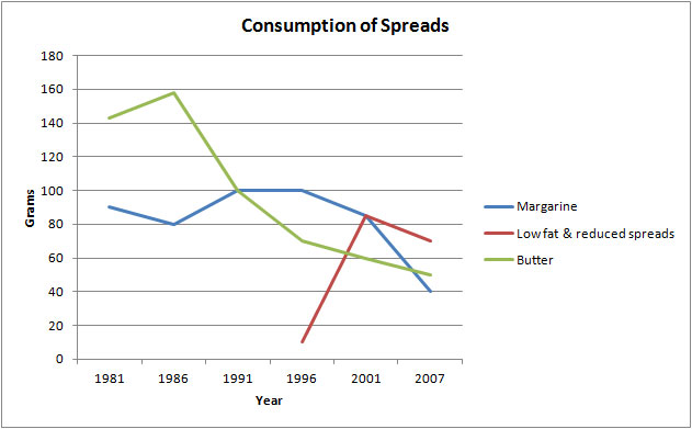
The graph below shows the consumption of three spreads from 1981 to 2007.

IELTS Line Graph

IELTS Line Graph Model Answer

The line graph illustrates the amount of three kinds of spreads (margarine, butter, and low fat and reduced spreads) which were consumed from 1981 to 2007. Units are measured in grams.

Overall, the consumption of margarine and butter decreased over the period given, while for low fat and reduced spreads, it rose.  At the start of the period, butter was the most popular spread. Margarine was the most widely consumed in the middle of the period but, by the end, low fat and reduced spreads was most popular.

With regards to the amount of butter used, it began at around 140 grams and then peaked at 160 grams in 1986 before falling dramatically to about 50 grams in the last year. Likewise, approximately 90 grams of margarine was eaten in the first year, after which the figure fluctuated slightly and dropped to a low of 40 grams in 2007.

On the other hand, the consumption of low fats and reduced spreads only started in 1996 at about 10 grams. This figure, which reached a high of just over 80 grams five years later, fell slightly in the final years to approximately 70 grams in 2007.

IELTS Line Graph 2: Five Lines

Essential tip for a line graph with many lines:

  • Don’t get lost in too much detail. Going beyond 200 words is very rare. Most tasks require only 170 and 190 words. Getting lost in detail and writing too much will give you a low score for Task Response, which counts for 25% of your marks. See this page: Band scores, Marking & Tips for bands 5 to 8.

IELTS Line Graph Model Answer

Line Graph Model Answer

The line graph illustrates how many weekly hospital admissions there were in Fortsmith, Adlin, Stanton, Bardley and Oxley, which are hospitals located in a European country, between 2004 and 2018.

Overall, for most of the period given Bardley had the most admissions, while Stanton had the least. Oxley was the only hospital to see a decline in admissions and Fortsmith was unique in that their admission figures remained relatively stable over the period. Admissions to all other hospitals increased during the years given.

Admissions to Oxley hospital started at just under 250 a week in 2004 but more than halved by the final year (just over 100 admissions). Fortsmith weekly hospital admissions fluctuated at around 200 for the whole period.

On the other hand, the number of people admitted to Adlin hospital rose dramatically from just over 100 in the first year to 250 by 2018. Likewise, Bardley also saw a rise from 200 to peak at over 250, the highest for any hospital. In terms of Stanton hospital, only approximately 70  people were admitted in 2008 and this gradually climbed to slightly over 150 in 2018.

Words = 187

Below are key steps for tackling an IELTS line graph:

  1. Paraphrase the line graph information for your introduction.
  2. Add axis information to your introduction if needed, such as categories or units.
  3. Put main trends and any other key features in an overall statement. The overview is the most important statement in your writing task 1. One sentence for an overview usually isn’t enough.
  4. Organise body paragraphs logically because you are being marked on this. Make sure to always have two body paragraphs (three occasionally). Decide which lines show trends that should be grouped together.
  5. Make sure each sentence in the body paragraphs has numbers and dates to support it. This is vital for Task Response.
  6. Ensure all data is accurate. If you are not sure the number is precise, write “about” or “approximately”.
  7. Use a range of linking words. Try not to repeat them.
  8. Aim for around 180 words for writing task 1. Try not to write over 200 words. More does not mean better.
  9. Line graphs have specific vocabulary that you must showcase. Learn nouns, adjectives, verbs and adverbs carefully: Line Graph Vocabulary

RECOMMENDED FOR YOU – IELTS WRITING TASK 1

Click below:

FREE SUBSCRIBE

Subscribe to get new lessons & tips by email.

.

Improving IELTS Writing Task 1 Introduction

This lesson focuses on improving your IELTS writing task 1 introduction for the academic paper. To write an introduction you must paraphrase and re-write the information given by IELTS about the chart of graph.

Below is a sample line graph sent to me by an IELTS Candidate.

The line graph below shows the number of overseas students who came from six Asian countries to study in Australia from 1994 to 1997.

overseas students line graph ielts

Source: Graph above was not created by IELTS Liz.

Introduction Paragraphs for Writing Task 1

Below are two introductions written by the IELTS candidate. Would you use one of these introductions or would you write a different introduction?

Introduction 1: The diagram shows the amount of students from six different countries in Asia, who came to study in Australia between 1994 and 1997.

Introduction 2: Between 1994 and 1997 the number of Asian students from six different countries, who came to study in Australia.

Questions:

  1. Do they cover all the necessary information?
  2. Are there any errors in them?
  3. How you would write your introduction to the line graph above?
  4. How many paragraphs would you have for your complete report for the above line graph?

Feel free to post your answers. However, please note I do not common on writing.

Answers and Model Introduction  

Click below to reveal the answers and model introduction paragraph. 

Answers & Model Introduction
  1. They both cover most of the important information. However, they are lacking the list of countries. Where possible include the list, unless it is too long. 
  2. Errors:
    1. A line graph is a line graph. Those words should not be paraphrased.
    2. Always try to paraphrase the verb “shows”.
    3. The word “amount” is for uncountable nouns, not for countable nouns. We can use this word with “people” or “students”. See this page: Uncountable Nouns
  3. See the model answer below:
    1. The line graph illustrates how many students from six different countries in Asia (Japan, Singapore, Hong Kong, Malaysia, Indonesia and Korea) went to Australia to study in 1994, 1995, 1996 and1997.
  4. How would you organise your task 1 writing for the above line graph? How many paragraphs would you have? What information would you put in the body paragraphs?
    1. You should have 4 paragraphs: introduction, overview, body paragraph A and body paragraph B.

      In body paragraph A, you can put information about Singapore, Malaysia, Indonesia and Korea. In body paragraph B, you can put information about Japan and Hong Kong because they showed different trends from the others.

.

IELTS Writing Task 1 Free Lessons & Tips

Click below to open all my free lessons and tips for task 1:

IELTS Writing Task 1 Free Lessons

………………..

Subscribe for Free to get New Lessons by Email

IELTS Line Graph and Bar Chart Model Answer (Band 9)

An IELTS line graph and bar chart model answer with examiner comments. Describing two charts together for IELTS writing task 1 academic paper is easy when you know how. Dual charts like the one below are very common in IELTS Writing Task 1 and appear each year.

IELTS Line Graph & Bar Chart

The line graph shows visits to and from the UK from 1979 to 1999. The bar chart shows the most popular countries visited by UK residents in 1999.

ielts-Line-and-bar-graph

Source: IELTS Cambridge English Test Books

Line Graph & Bar Chart Model Answer

The line graph illustrates the number of UK residents going abroad from the UK and overseas residents visiting the UK between 1979 and 1999. The bar chart gives information about how many UK residents travelled to five of the most popular countries in 1999. Units are measured in millions of people.

Overall, there was an increase in the number of visits to and from the UK and there were more visits abroad by UK residents than visits to the UK by overseas residents over the period given. Furthermore, the most popular country to visit by UK residents was France in 1999.

According to the line graph, the number of UK residents visiting overseas  began at just under 15 million in 1979 and rose significantly to reach over 50 million in 1999. Around 10 million overseas residents visited the UK in the first year before climbing steadily to just under 30 million by the final year.

Regarding the bar chart, in 1999, the two most popular countries were France and Spain (visited by 10 million UK residents and approximately 9 million respectively). The USA and Greece had about 4 million and 3 million visitors. The least popular country visited was Turkey, which had only about 2 million UK residents going there.

Examiner Comments

This IELTS writing task 1 report describing both a chart and a graph is organised into logical paragraphs. The introduction introduces both charts and the overview contains the key features of both chart. Detail in the body paragraphs is supported by data. The right language is used for the line graph and there are a range of sentence structures used throughout.

Paraphrasing

  • shows = illustrates / gives information about
  • the number = how many
  • visits abroad by UK residents = UK residents going abroad = UK residents travelling to…
  • from 1979 to 1999 = between 1979 and 1999 = over the period given
  • rose = climbed
  • about = approximately = around

RECOMMENDED FOR YOU:

Click below:

FREE SUBSCRIBE

Subscribe to get new lessons & tips by email.

.

Dairy Product IELTS Line Graph Practice Exercise

This lesson is to practice vocabulary for line graphs.

The graph below shows the consumption of four types of dairy products in the USA from 1970 to 2010.

cheese-dairy-consumption-graph

Source: IELTS Liz did not design the above graph.

Questions 1-6

Complete the details using no more than three words for each gap.

The amount of cheese eaten by people from the USA (1)…………….. (2)…………………….. from about 7 pounds in 1970 to reach a (3)…………… of over 20 pounds in 2010. Likewise, the consumption of yoghurt (4)………………. from just over 0 to just under 10 pounds in the final year. There was (5)………………… in the amount of full-fat ice cream eaten of about 2 pounds to reach about 9 pounds in 2010. The consumption of low-fat ice cream(6) …………. at around 4 pounds over the period given.

Answers

  1. rose / climbed / increased / went up
  2. steadily / significantly / considerably
  3. peak
  4. rose / climbed / increased / went up
  5. a decrease / a fall / a decline / a drop  /  a slight  fall / a marginal decrease / a minimal drop
  6. fluctuated

.

Recommended

FREE SUBSCRIBE

Subscribe to get new lessons & tips by email.

.

How to write a line graph for IELTS writing task 1

Learn how to describe a line graph for IELTS writing task 1. IELTS Line graphs are common in writing task 1 along with bar charts, tables, maps, diagrams and pie charts. This lesson was last up-dated in 2018.

The guidelines below will help you structure your line graph answer and focus on the right aspects for a high score.

Steps: How to write IELTS Line Graphs

  1. Have a clear introduction.
    1. try to include all information from the two axis and the names of categories.
  2. Put all main trends in an overview statement – this should be contained in one paragraph.
    1. do not divide your key points into different paragraphs. Make sure you include the main increases and decreases shown.
  3. Use a range of vocabulary and do not make spelling mistakes.
    1. Use different verbs and nouns
    2. Use a range of adjectives and adverbs
    3. Vary your time phrases
    4. Click here to get a word list: LINE GRAPH VOCABULARY
  4. Don’t always give from … to … for the amounts, sometimes you can give the difference “it increased by double..”.
  5. Put numbers or percentages to support your sentences in the body paragraph. Failure to do that will result in a low score.
  6. Organise your body paragraphs logically so it is easy for the examiner to read.
    1. Leave an empty line between paragraphs to make them easier to see. This is not a rule, it is a strong recommendation.
  7. If the line graph contains many lines and a lot of movement, be selective. You are being marked on your ability to select key features.
  8. Don’t spend more than 20 mins on task 1. You will need a full 40 mins for task 2.
  9. Write 150 words or more. Aim for about 160-190 words. Don’t write under the word count.
  10. Follow well-written model answers.
    1. Click here: IELTS Writing Task 1 Model Answers

Line Graph Sample

It is not common to be given only one line in IELTS writing task 1. However, this answer will provide you will an example of vocabulary, layout and general content.

  • Source: IELTS Liz

Line Graph Model Answer

The graph illustrates how many people from the age of 65 and above were reported to have contracted influenza in a particular village in the UK from 1985 to 1995.

Overall, the number of cases of elderly people with influenza increased over the period given. The highest number of people with the illness can be seen in 1991.

In 1985, the number of cases of influenza stood at 40 and then rose steadily over the next three years to reach 55 in 1987. In the following year, 1988, the figure dipped slightly to below 50 after which it rose significantly to reach a high of 75 in 1991.

From 1991, there was a decrease to about 60 in 1993 of the number of reported cases of influenza. From this point, except for a slight increase of about 5 cases, the number remained at about 60 at the end of the period.

151 words

Focus Points:

Take time to read through the model and pay attention to:

  1. the content of each paragraph
  2. the use of verbs, nouns, adverbs and adjectives
  3. the logical order of information in the body paragraphs

Please note: this is a practice exercise lesson. It is rare for IELTS to give a one-line graph. So, use this to practice language and technique.

Recommended

All the best

Liz

IELTS Two Line Graph: Sample Answer & Exercise

Here is an IELTS line graph sample answer describing two lines. You must fill in the gaps to complete the model writing task 1. Answers are given below. If you wish to learn more vocabulary for a line graph, follow the link.

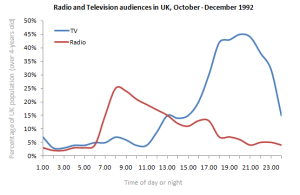
The line graph below shows radio and television audiences throughout the day in 1992.

Source: Graph below was not designed by IELTS Liz. Source unknown.


two line graphs

Line Graph Sample Answer

Fill in the gaps to complete the sample answer for the above line graph. You can use more than one word in each answer.

The line graph illustrates the (1) ………………………… of people listening to the radio and watching TV who were over the age of 4  in (2) …………………… period, in the UK from October to December 1992.

Overall, the (3)…………………….. of people listened to the radio in the morning while (4)………………. people watched TV in the evening. Over the 24 hour period, there were more people watching TV than there were listening to the radio.

(5)……………………. the TV, at 1am there were under 10% of people watching TV. This (6)…………………………… remained relatively (7)…………….. until 11am when there was a (8)……………. increase in people watching TV before (9)………….. at approximately 45% at around 9pm. After that time, there was a (10)…………… drop in viewers to under 20% by midnight.

Similarly, the percentage of listeners to the radio also began low at under 5%. After continuing at under 5%, the figure then rose (11)……………… to a (12) …………. of almost 30% at about 8am. From that point, the proportion of audience (13) ………………. in a gradual (14)……………… trend to 5% at the (15) ………. of the day.

Answers

  1. proportion / percentage
  2. a 24 hour
  3. majority
  4. most
  5. Regarding / With regard to / In regard to
  6. figure
  7. stable / constant
  8. steady / gradual
  9. peaking
  10. sharp / rapid / dramatic / sudden / considerable / significant
  11. sharply / rapidly / dramatically / suddenly / considerably / significantly
  12. peak / high
  13. fluctuated
  14. downward
  15. end


Recommended


FREE SUBSCRIBE

Subscribe to get new lessons & tips by email.

.

IELTS Writing Task 1: Line graph 4 main sentences

Learn how to make 4 different complex sentences for a line graph report. It is important to show the examiner that you can make a range of complex sentence structures.

It’s not difficult. You can easily improve your range of complex sentences.

Transcript

Hello in this lesson I’m going to show you
how to write

different complex sentences for

a line graph report in IELTS writing
task 1

it’s very important when you write

your body paragraphs for your

IELTS task 1 that you have a range

of different complex sentences to show
the examiner

now in a previous lesson

I showed you how to write a sentence

similar to this if you haven’t watched
that

lesson please watch it is very important
that you understand how to make

the sentence so what I’m going to do is
I’m gonna take this sentence

the same information and change

the order so that we have different
structures

let’s have a look at the sentence first

the number of people becoming a vegetarian

that is our subject it’s quite long

after the subject we’ve got the verb

and if you look at the dates you can see
that it is

the past tense after the verb we need to

described the movement and that

is we say its increased steadily

so that’s our adverb after that

we had the numbers and after the numbers

we had that date so let’s

change that a little bit and write the
sentence in a different way

well one way we could change as we could
start with the dates

so between 2004

and 2007

the number

of people

we say becoming vegetarian increased

steadily from

about 75

to 200 I’ll stop there often when
we put the date first

we have a comma after that

and then we have the number of people

so that’s one way to change it now

there are more ways let’s have a look at
another way

the next way I’m gonna show you to
change that

is can you see this word here increased

now that’s a verb but

we could also use it as a noun an

increase so I’m gonna write a sentence
using

this word as a noun to do that we need
to start with

there was an increase

okay we always start with there was if it
past tense of course

so there was and lets

stop for a minute because here we’ve got

the word steadily which is an adverb

now we still want to use that word

but because this will be a noun we need
to use this

as an adjective so

if we have an adjective it usually comes

before the noun so that means we need to
change the order

and the form of the word so there was

a steady

increase so

again very important remember if it’s
a verb you have the adverb

afterwards if it’s a noun

you have adjective in front and
we change from steadily

to steady so there was a steady increase

now we need to give this information

but to do that we need to use a
preposition first

and the preposition is

in so there was

a steady increase in the number

of people

we could say becoming vegetarian

if we want to develop that so we’ve got
that

now we need the numbers

from about 75

to 200 and what’s missing

well the dates are missing

got between 2004

sorry 2004

and 2007

so that is another way to structure

your sentence and still give

all the information we need with the
numbers

and the dates now there;s one more way

that I’d like to show you so let’s have a
look

so the last way I’m gonna show you in
this lesson

is again to use this as

an noun but we changed the sentence
structure

again so the number of

people becoming

vegetarian

experienced a steady

increase

so with this sentence we’ve got the verb
experienced

the number experience the figure
experienced

we could also say witnessed after the

verb we’ve got the noun a steady

adjective a steady increase

and we got a steady increase

from about 75

to 200

between 2004

and 2007

so now we’ve added the numbers

and the dates well those are the 4

main complex sentences you can use

when you write your line graph report
for IELTS

writing task 1 there are other
sentences we can use but they are the

four

main ones that you need to practice and

perfect which means write without

too many mistakes remember the more mistakes you
make

lower your band score will be

so please practice writing those
sentence structures

well that’s all for this lesson I
hope that was useful for you

please remember to press like or share it
with your friends

if it was useful well I’ll see you
again

in another IELTS lesson

error: Content is protected !!