Dec 2016 IELTS Writing Task 1 Sample Answer

Below is model answer for an IELTS bar chart and pie chart together for Writing Task 1. The sample answer is estimated at about band score 8.  The sample answer contains some grammar errors – can you find them? Answers below.

IELTS Writing Task 1: Multiple Charts

ielts-writing-task-1-reported-dec-2016

December 2016, Sample Answer

Estimated at band score 8. It contains a few mistakes which is why it isn’t band 9. Can you find the mistakes?

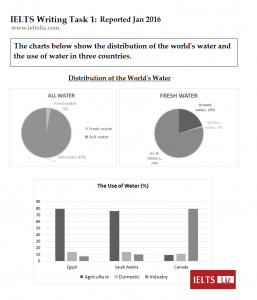
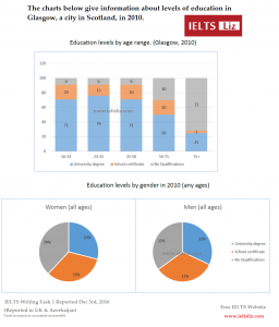
The bar chart and pie charts illustrate the percentage of people in Glasgow having three levels of education (university, school and those with no qualifications) in 2010. Information is divided into five age groups in the bar chart and by gender in the pie charts.

Overall, the majority of people with university education were in younger age groups, while in the oldest age group most people did not have any qualifications. The proportions of men and women were similar and showed little different between the levels of education.

The percentage of people with university education was up to 76% in the younger three age groups compared to only 50% in those ages 50 to 75 and just 25% in those over 75. This trend was reversed in those with no qualifications (9% in younger people rising to 72% in the oldest age group). The figure for those with school education was relatively constant at around 20% but was as low as 3% in the over 75’s.

The proportion of men and women in each level of education was around one third with only a slightly difference of 3% in university graduates as well as those who didn’t have educational qualifications.

Words = 198

There are a few grammar mistakes in this writing. Can you find them? Answers provided below

Answers

Answers to Grammar Mistakes in the above sample answer – click below to open:

ANSWERS TO SPOT THE MISTAKES ABOVE

Paragraph 2: in younger age groups = in the younger age groups

Paragraph 2: little different = little difference

Paragraph 3: in those ages 50 to 75 = in those aged 50 to 75

Paragraph 4: a slightly difference = a slight difference

Paragraph 4: didn’t = did not


Main IELTS Pages

Develop your IELTS skills with tips, lessons, free videos and more.

Get my free lessons by email

Subscribe for free to get my new IELTS lessons sent to your email inbox.


Answer for IELTS Writing Task 1 2016

The IELTS model answer below is for a recent IELTS writing task 1 which was reported in early 2016. The two pie charts and bar chart are illustrated beneath the report. Further down the page, you will also find examiner comments and a download link for this model answer and task. Also note the useful links provided for more IELTS writing task 1 lessons. This is for the IELTS writing task 1 academic test.

IELTS Model Answer, Reported 2016

The pie charts give information about how the world’s water is distributed, whereas the bar chart illustrates the percentage of water used in agriculture, domestic use and industry in three countries (Egypt, Saudi Arabia and Canada).

Overall, salt water makes up an overwhelming majority of the world’s water. Fresh water is made up of mainly water from ice and glaciers. While most water in Egypt and Saudi Arabia is used for agriculture, in Canada it is predominantly used for industry.

The pie charts show that 97% of global water is salt water compared to a mere 3% which is fresh water. Water from ice and glaciers accounts for 79% of all fresh water as opposed to ground water and surface water (20% and 1% respectively).

In terms of the use of water, both Egypt and Saudi Arabia use almost 80% of their water for agriculture in comparison to domestic usage and industry which account for approximately 15% and 10% respectively. The reverse is seen in Canada where only 10% of water is used for agriculture and domestic purposes in contrast to industry, which uses 80% of water in Canada.

Words = 189

IELTS Writing Task 1 Charts Jan 2016

Download this writing task 1 with model answer: IELTS Writing Task 1 Charts & Model 2016

Examiner Comments:

The information is well organised into logical paragraphs. The overview paragraph contains the key features of all charts. Information is accurate and no irrelevant information is given. There is a flexible range of linking devices for showing comparisons. Vocabulary is well used and this report contains complex sentence structures.

Recommended

Get my free lessons by email

Subscribe for free to get my new IELTS lessons sent to your email inbox.

IELTS Line Graph and Bar Chart Model Answer (Band 9)

An IELTS line graph and bar chart model answer with examiner comments. Describing two charts together for IELTS writing task 1 academic paper is easy when you know how. Dual charts like the one below are very common in IELTS Writing Task 1 and appear each year. (last updated in Oct 2023).

IELTS Line Graph & Bar Chart

The line graph shows visits to and from the UK from 1979 to 1999. The bar chart shows the most popular countries visited by UK residents in 1999.

ielts-Line-and-bar-graph

Source: IELTS Cambridge English Test Books

Line Graph & Bar Chart Model Answer

The line graph illustrates the number of UK residents going abroad from the UK and overseas residents visiting the UK between 1979 and 1999. The bar chart gives information about how many UK residents travelled to five of the most popular countries in 1999. Units are measured in millions of people.

Overall, there was an increase in the number of visits to and from the UK and there were more visits abroad by UK residents than visits to the UK by overseas residents over the period given. Furthermore, the most popular country to visit by UK residents was France in 1999.

According to the line graph, the number of UK residents visiting overseas  began at just under 15 million in 1979 and rose significantly to reach over 50 million in 1999. Around 10 million overseas residents visited the UK in the first year before climbing steadily to just under 30 million by the final year.

The bar chart shows that in 1999, the two most popular countries were France and Spain (visited by 10 million UK residents and approximately 9 million respectively). The USA and Greece had about 4 million and 3 million visitors. The least popular country visited was Turkey, which had only about 2 million UK residents going there.

Examiner Comments

This IELTS writing task 1 report describing both a chart and a graph is organised into logical paragraphs. The introduction introduces both charts and the overview contains the key features of both chart. Detail in the body paragraphs is supported by data. The right language is used for the line graph and there are a range of sentence structures used throughout.

Paraphrasing

  • shows = illustrates / gives information about
  • the number = how many
  • visits abroad by UK residents = UK residents going abroad = UK residents travelling to…
  • from 1979 to 1999 = between 1979 and 1999 = over the period given
  • rose = climbed
  • about = approximately = around

Recommended

IELTS Writing Task 1: Tips, Lessons and Model Answers

Main IELTS Pages

Develop your IELTS skills with tips, model answers, lessons, free videos and more.

IELTS Bar Chart Sample Answer

Below is a band score 9 sample answer for an IELTS  bar chart in writing task 1. Below the model is a link to a video lesson about how to describe an IELTS bar chart. Watch the video to learn essential tips for each paragraph for a high score bar chart.

IELTS bar chart

The bar chart illustrates how many children, divided by gender, played six kinds of sports (tennis, badminton, cycling, swimming, football and hockey) in a town in England in 2012.

Overall, the number of  boys playing sport exceeded that of girls in the given period and the sport with the most significant difference between the genders was football. Football was also the most popular sport for boys while the majority of girls preferred swimming. Furthermore, both males and females least preferred playing hockey.

There were four sports in which boys participated more than girls. While 60 boys played football, the number of girls playing that sport was considerably lower (around 20).  With regards to tennis, the figure for boys who played that sport was 50 as opposed to just under 40 for girls. Similarly, more boys cycled than girls (approximately 35and 20 respectively). The difference, in terms of hockey, was minimal with only about 5 more boys playing that sport than girls.

On the other hand, more girls took part in the two remaining sports which both showed a difference of about 10 between the genders. As many as 50 girls preferred swimming in comparison to 40 girls for badminton.

Recommended Lessons

error: Content is protected !!